Thursday 19 June 2008

D1 Justification of Tools Used to Create Image

The image that i created was the new version of windows for the display at the Birmingham NEC. This image is shown below.


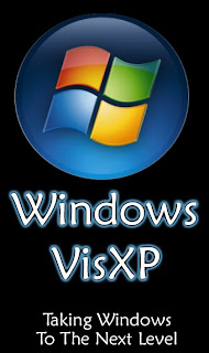
This image met the clients needs because it is large and easy to see. It stands out and can be read easily from afar. Even if you could not see the text you would be able to see the Mcrosoft Wndows logo and know that something was going on at this stand to do with Microsoft.

I used Adobe Photoshop Elements to create this image because of a number of different reasons. Firstly it is easy to create good looking text and make the text big without loosing the quality of it. You can also make text that looks good small, just like the text at the bottom of the image.

I also used this program to make the image because you can easily export the image as a JPEG at 100% quality so the image does not lose quality when exported. You can export is as many different other file formats but JPEG keeps the quality of the Photoshop file and keeps it looking good.

I also used this program because you can change the image resolutions and colour depths easily. Keeping the colour depth at 72 means that the quality of the image is kept to the best that it can be and when printed out the quality is also good. This is because most printers use the 72 bit colour depth as standard and so the quality is not lost. Also you can change the image resolution when ever you want and keep the image quality good. Making the image resolution to big can make the image pixelated but ultimately the image will look the same.

Friday 13 June 2008

M3 What Impact of Resolution and Colour Depth have on File Size and Quality


The 3 images that are above are what happens when you change the size and quality of the image. The first image is the original image, the second image is the enlarged image which has lost some quality because of this and the third image is low quality image when saved.
When the image is enlarged the quality of the image is lost, this is because it is stretched and the image becomes pixelated.
When the image is saved with much less colours the image becomes pixelated and looks bad.

Thursday 12 June 2008

Potential Legal Implications P6

There are many different possible types of legislation when taking and using graphic images. The main one is the copyright act. This is where someone creates and image and copyrights it so that no one can use it without being allowed to by the creator. The copyright act is shown below.

Copyright is a legal concept, enacted by most governments, giving the creator of an original work exclusive rights to it, usually for a limited time. Generally, it is "the right to copy", but also gives the copyright holder the right to be credited for the work, to determine who may adapt the work to other forms, who may perform the work, who may financially benefit from it, and other, related rights. It is an intellectual property form (like the patent, the trademark, and the trade secret) applicable to any expressible form of an idea or information that is substantive and discrete.

This was taken from http://en.wikipedia.org/wiki/Copyright

You would have to identify ownership of an image as well. Sometimes an image has a signature on it or the copyright symbol. Sometimes there may not be anything on an image, but this usually means it belongs to the website. You must find out if you intend to use the image.

If you wish to use copyrighted material then you must get in touch with the person that copyrighted the image and get permission from them. If you are going to make money from the website or the image then the copyrighter needs a cut of the profits.

You can get hold of many free images from the internet and there are many different websites you can use.

P5

I have 3 images, 1 is a photograph, 1 is a scanned image and 1 is the image i created using them.

The image below is the photograph.


The image below is the scanned image.


The image below this is the image that i created.

Wednesday 11 June 2008

P5

Description

I need to create a poster to make people think about throwing rubbish outside. It should have some large text to make sure that people get the point of the picture and show some kind of rubbish around.

Audience

Needs to be attention grabbing
Anyone needs to be able to understand it
Beginning Image


This image was taken out side near the college I go to. It is pretty basic but i managed to do something with it.

Final Design


My design meets the specifications quite well. It has a big heading which stands out and gets the message of the image out. The bin has been taken from the original image and been placed infront of the background. This gets the fact rubbish should be put in the bin.